TREK UI Kit
Scope
UI, Component Library, Design System
Overview
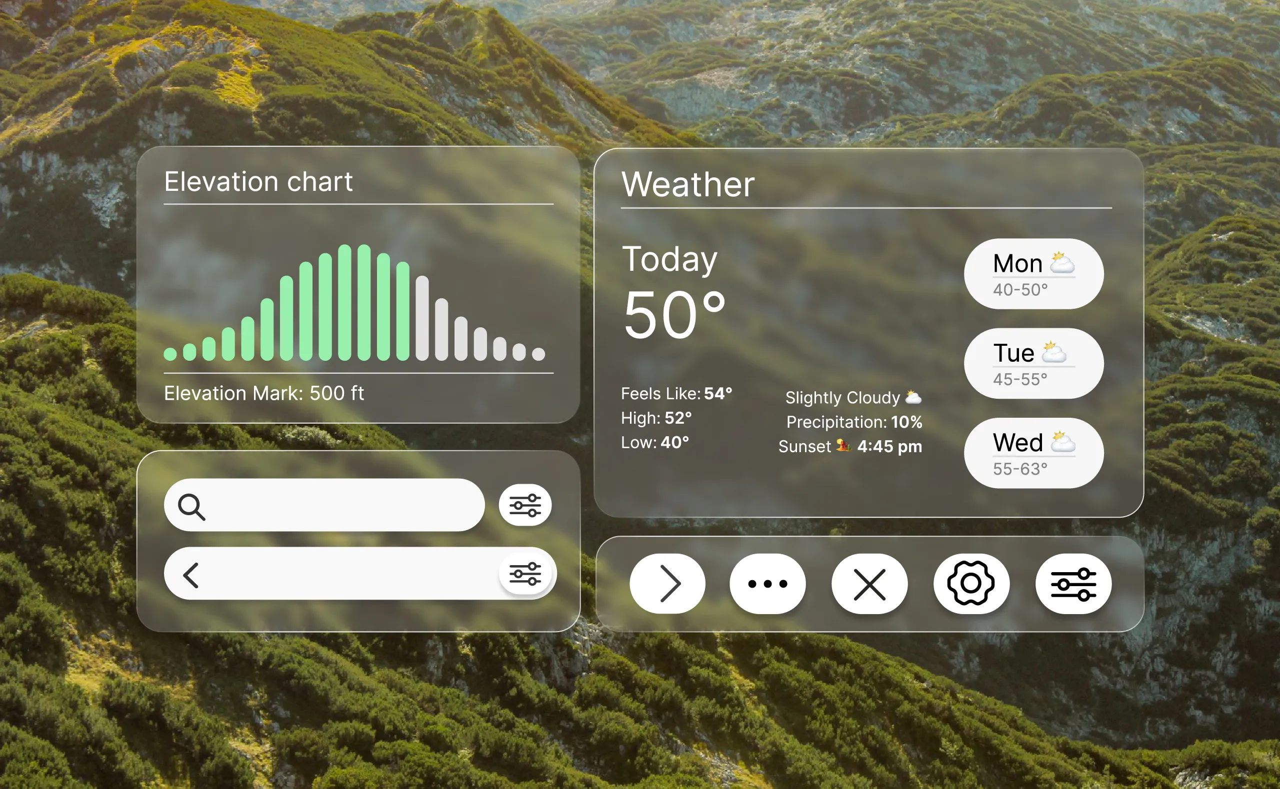
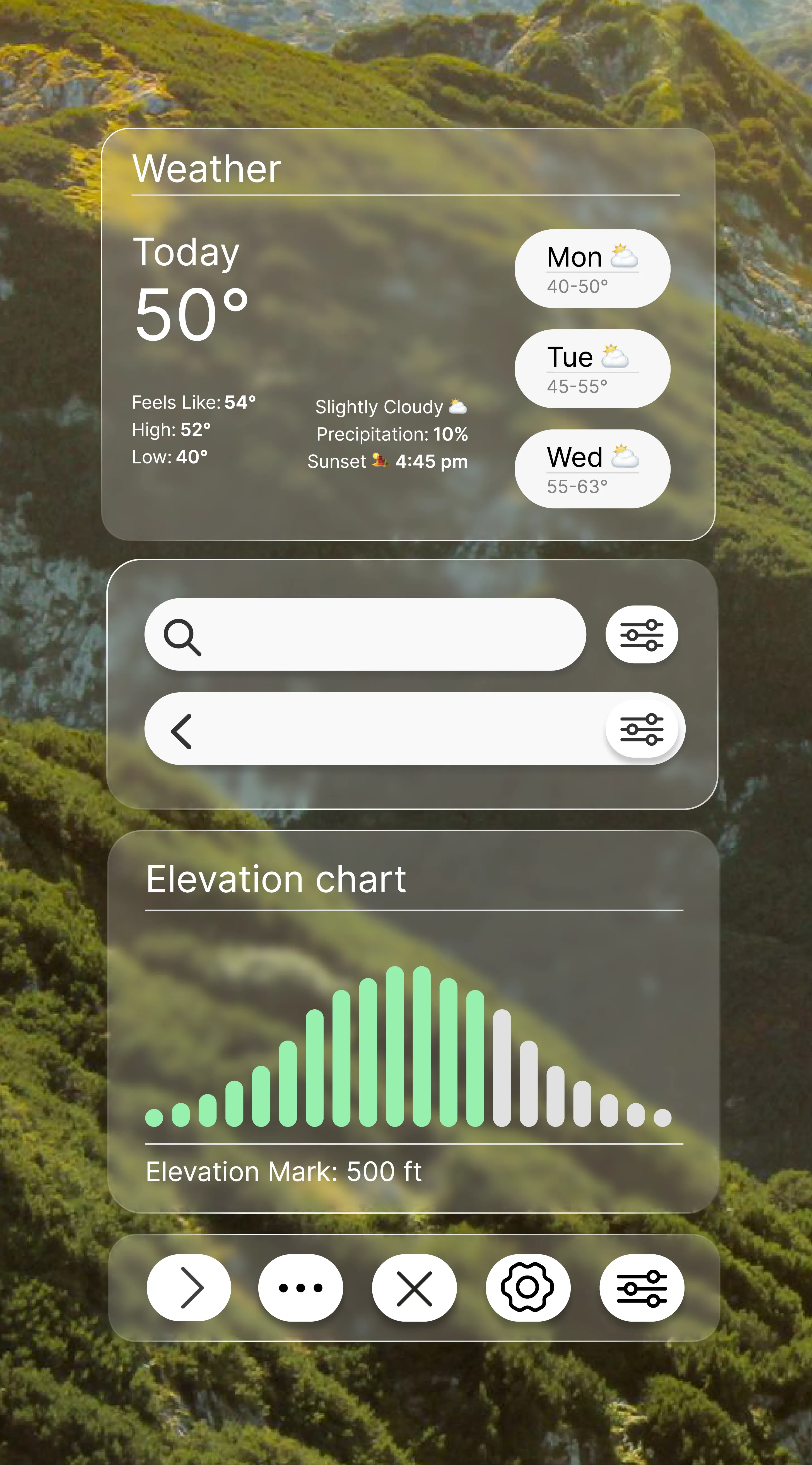
The TREK UI Kit is a component library designed as a focused exercise in modular UI architecture. The goal was to build a comprehensive system of individual components that serve as the fundamental building blocks for functional user interfaces. Each element shares a unified visual language while intuitively communicating its purpose and state to the user. By prioritizing strict consistency and scalability, these components can be deployed across a wide variety of digital products and applications.
Goal
My goal for this project was to develop an adaptable, fluid design system. I focused not only on standard UI components but also on more specific elements to ensure the system could scale across an entire digital ecosystem. Rather than designing a single, static application, I anchored my visual language and component decisions around a conceptual trail and hiking app named 'TREK.' Using this specific archetype provided a framework that informed my component selection, interaction states, and overall visual direction.
Atoms
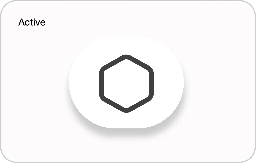
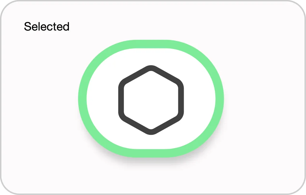
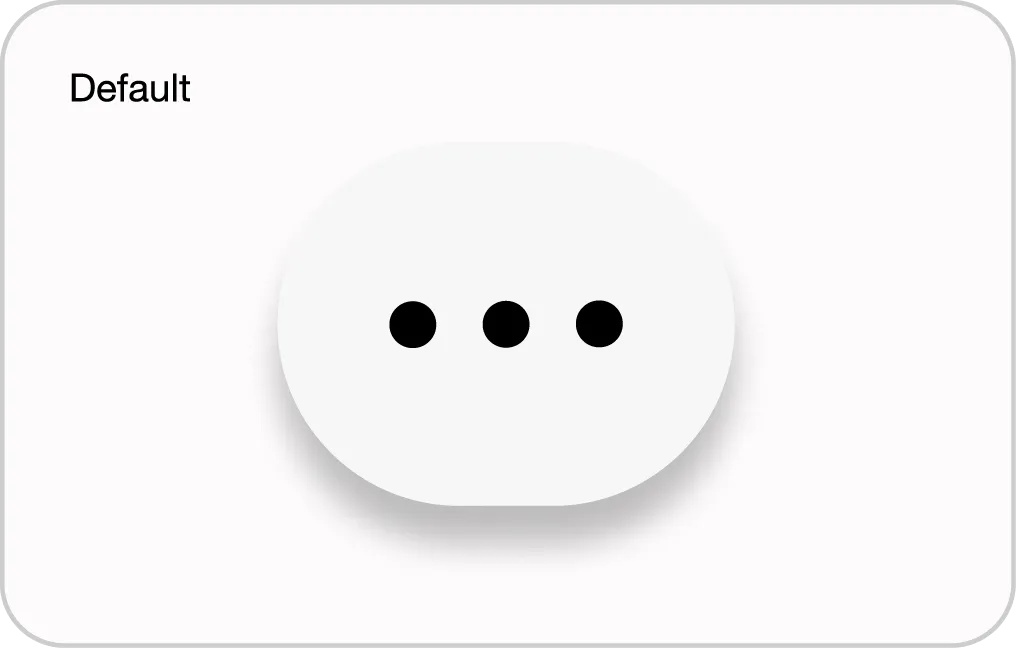
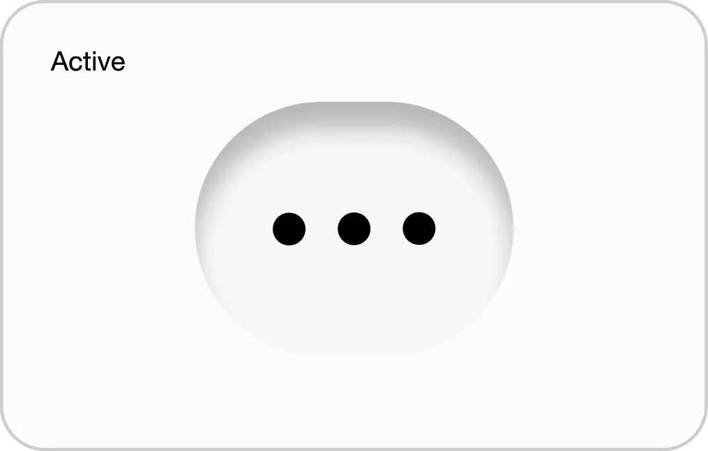
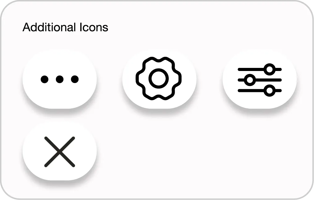
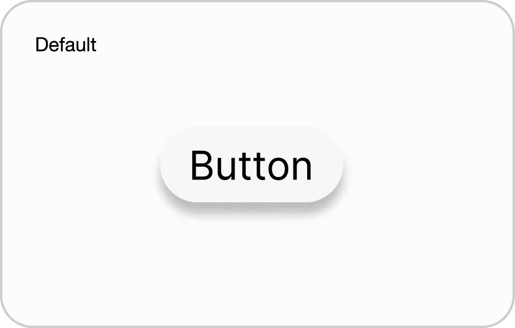
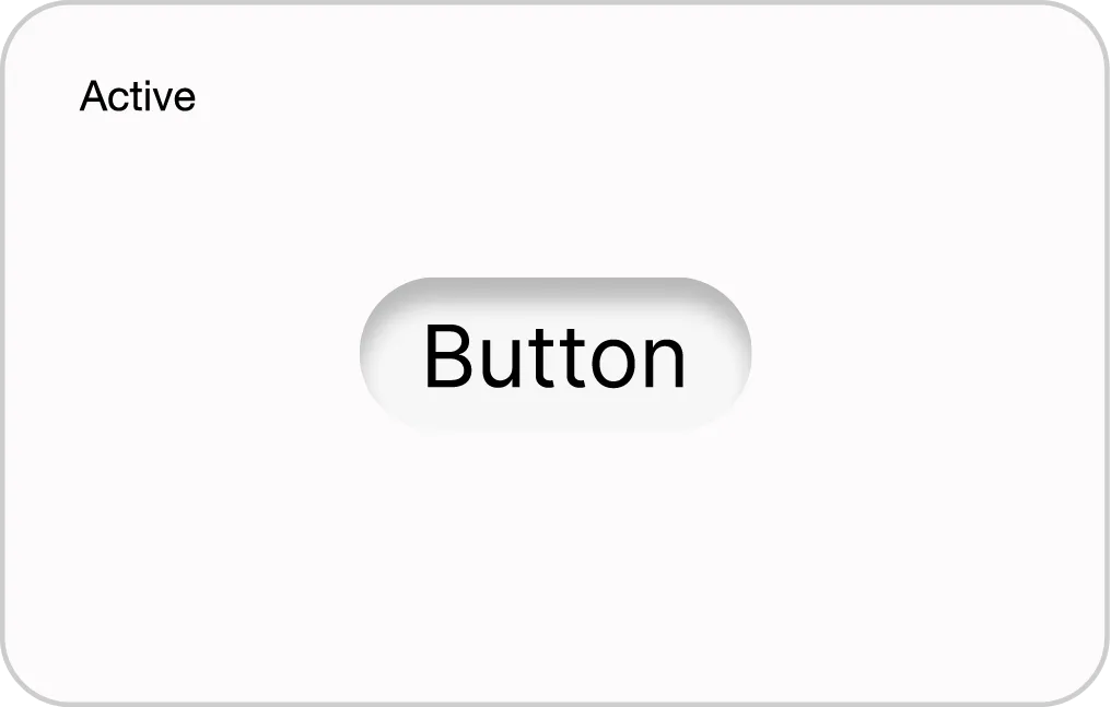
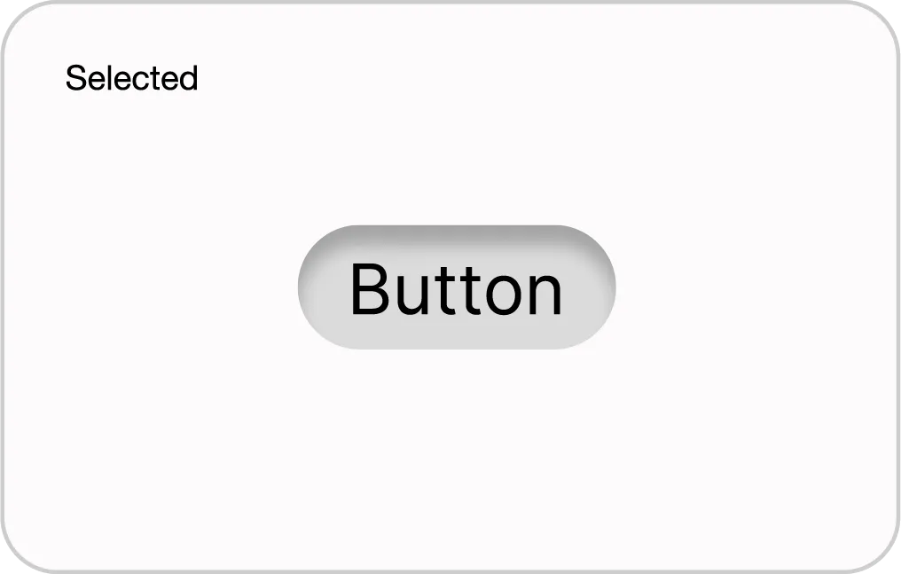
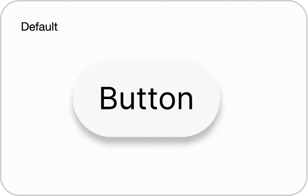
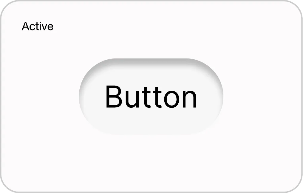
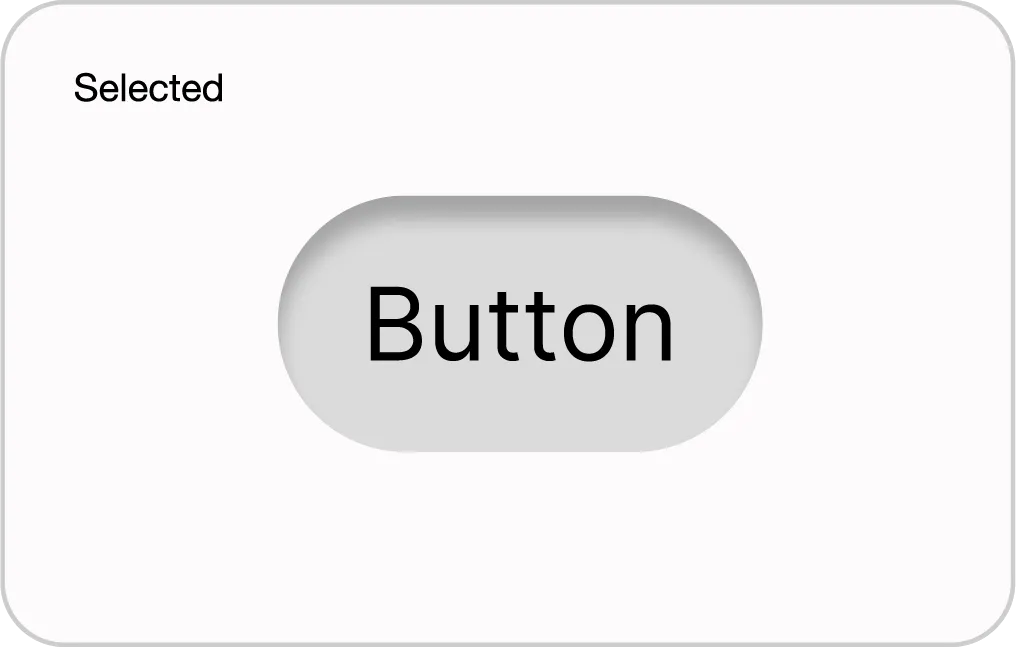
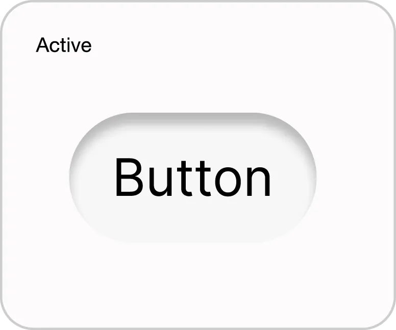
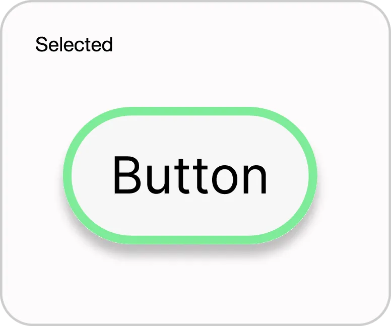
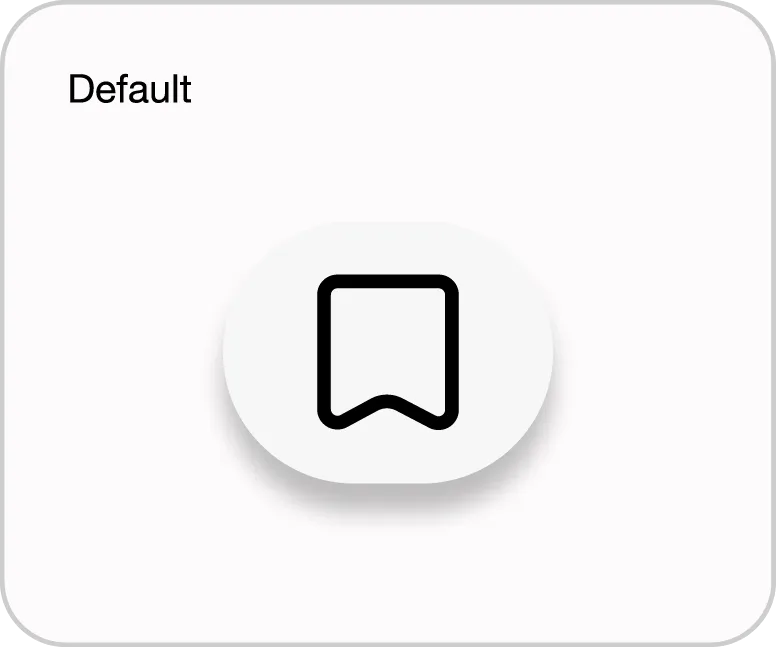
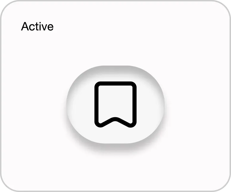
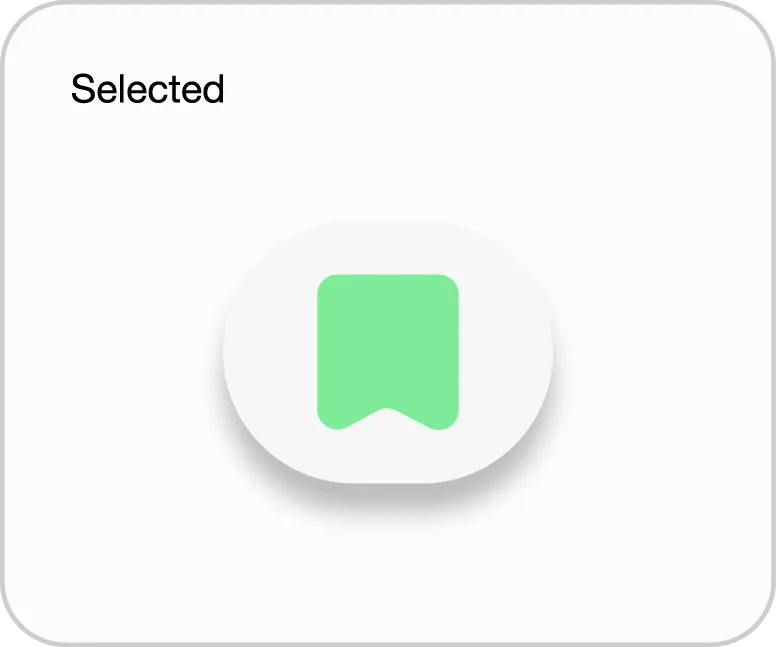
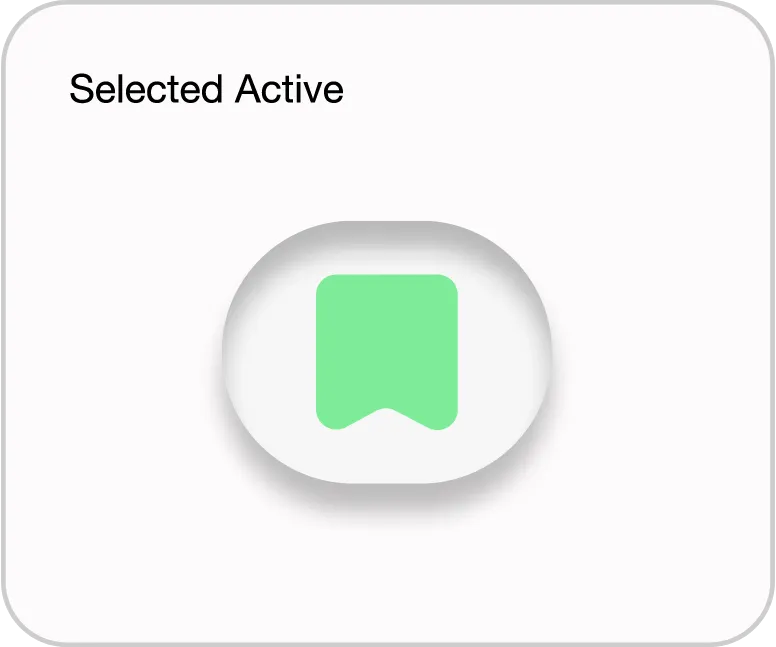
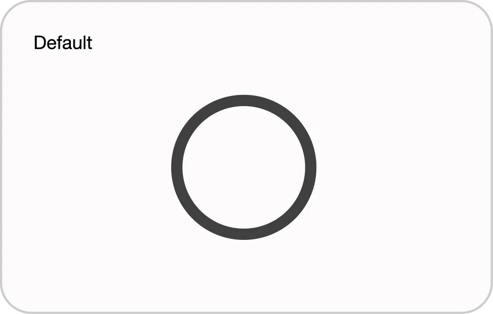
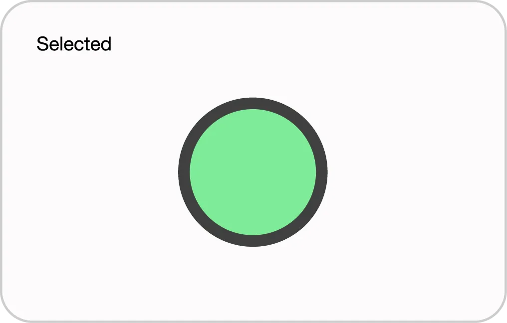
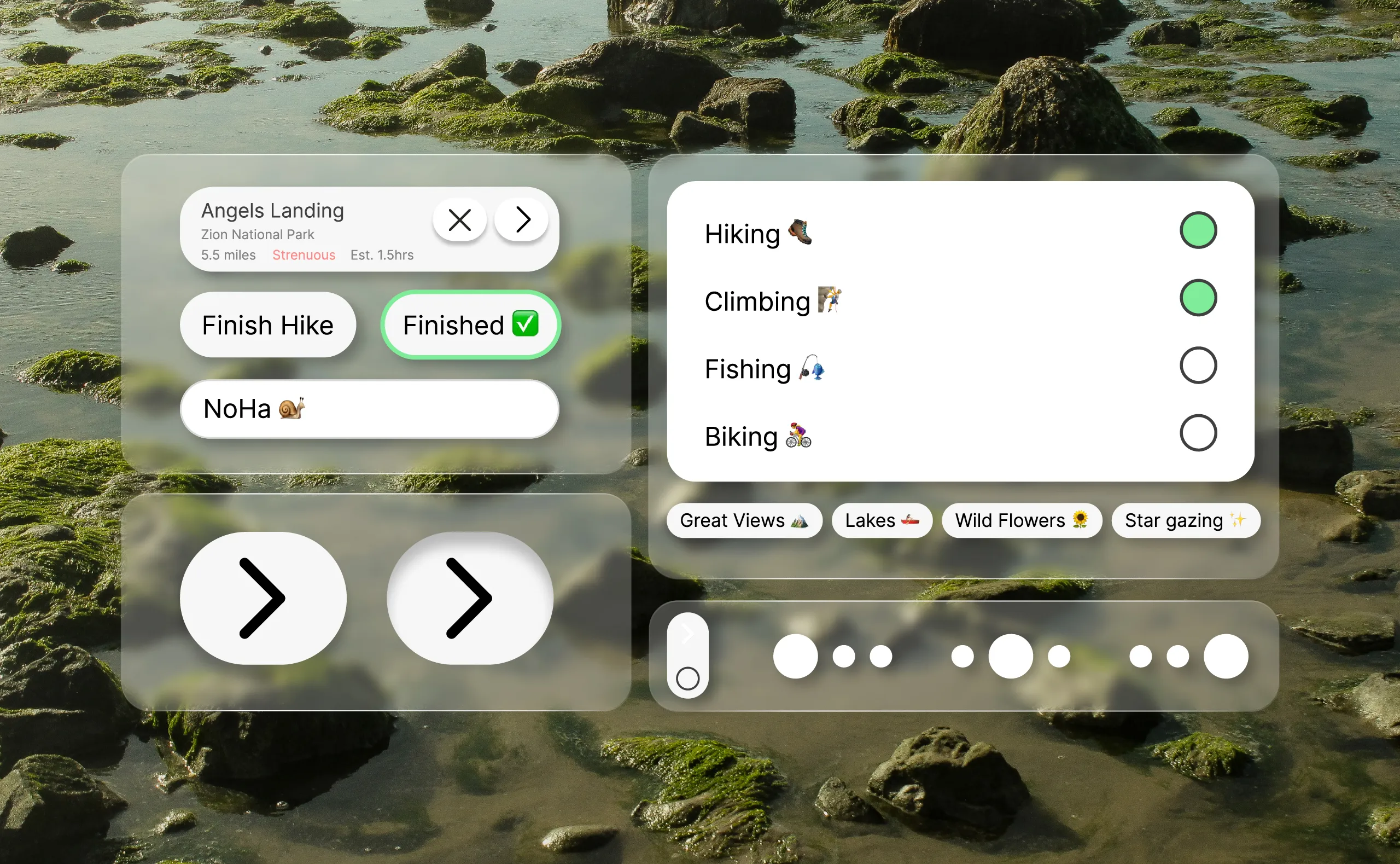
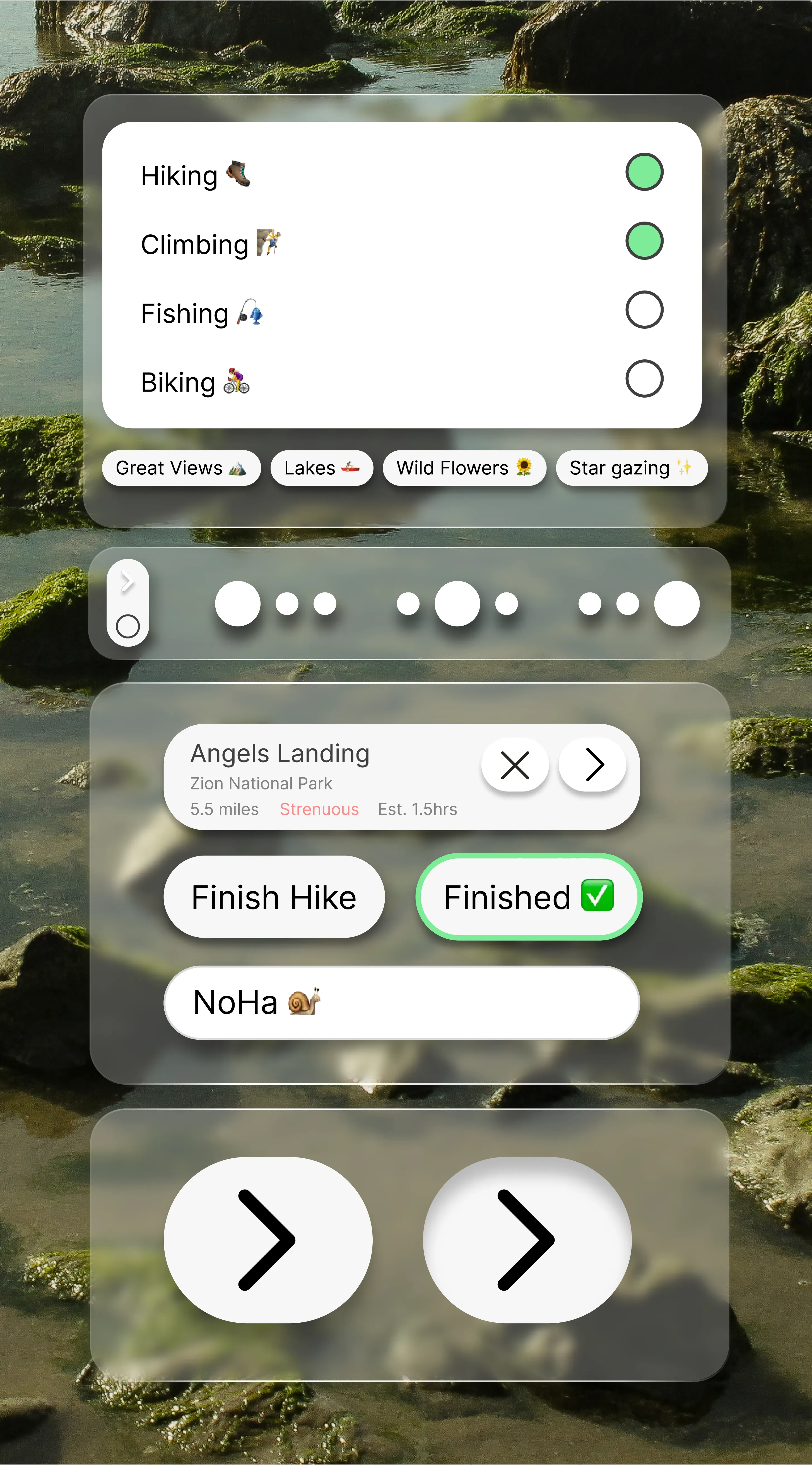
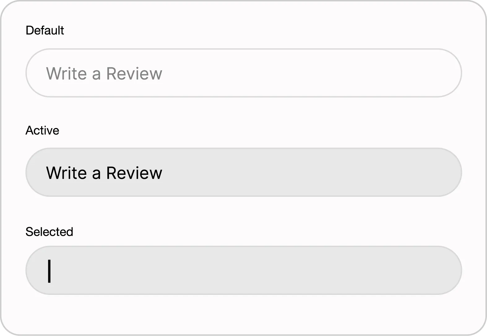
Atoms were the core building blocks of TREK. I designed these to be the foundation for every larger molecule and organism in the system. The focus here was on state logic, making sure that every button and input gives the user clear visual feedback through defined default, active, selected, and disabled states.
Lower Nav Buttons

Main Icon Buttons
Text Button
Green Text Button
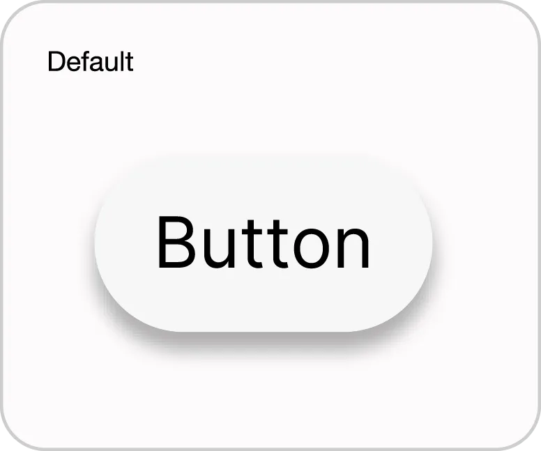
Saved Button
Radio Button
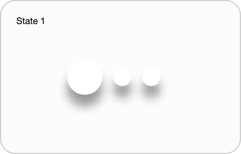
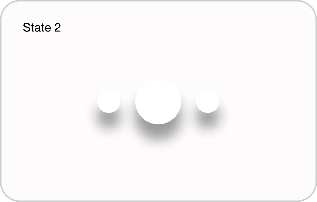
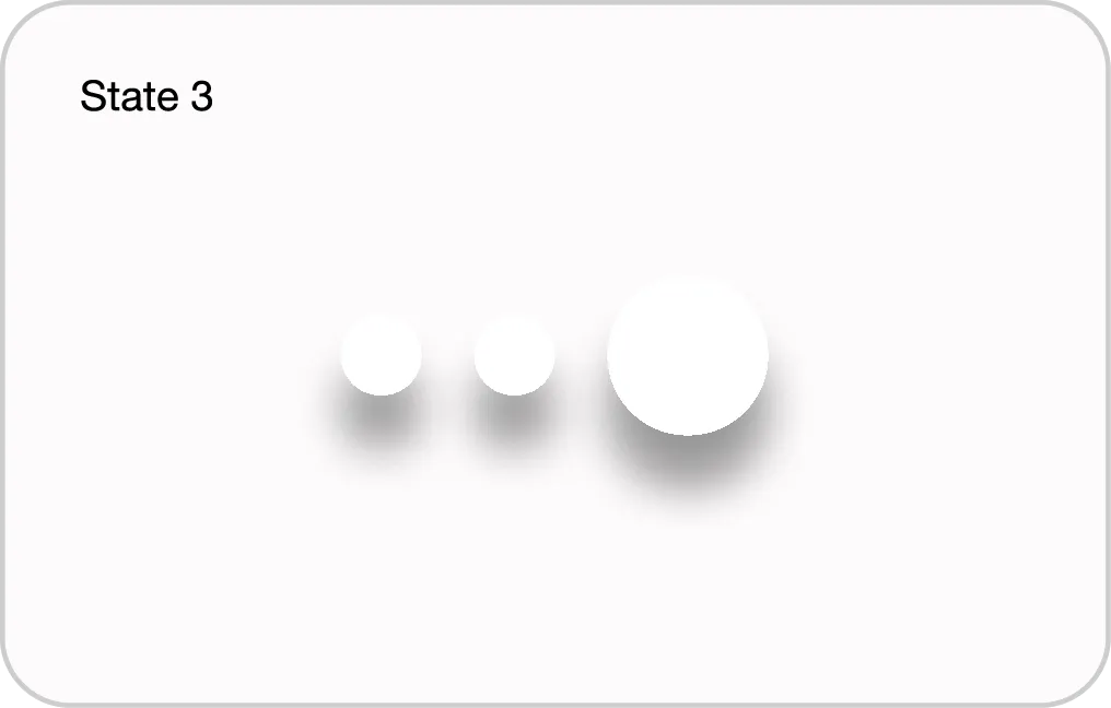
Pagination

Molecules
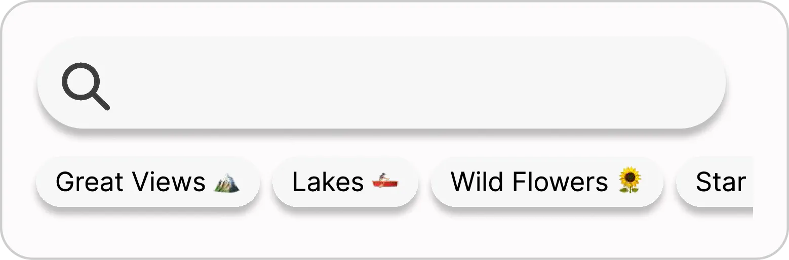
The molecules are where the system starts coming together. By combining two or more atoms, I created functional groups that handle more complex tasks. While some molecules are built entirely from existing atoms, others introduce specific design elements and functions needed to bridge the gap between a single button and a full layout.
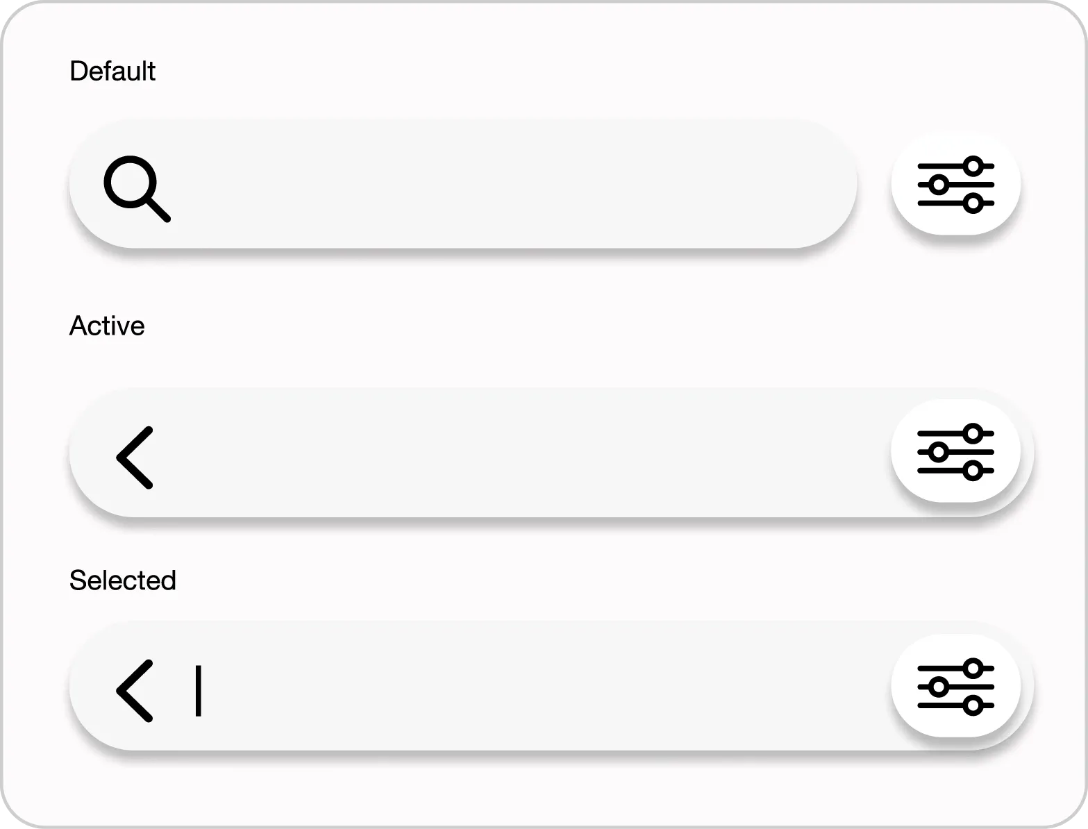
Search Bar
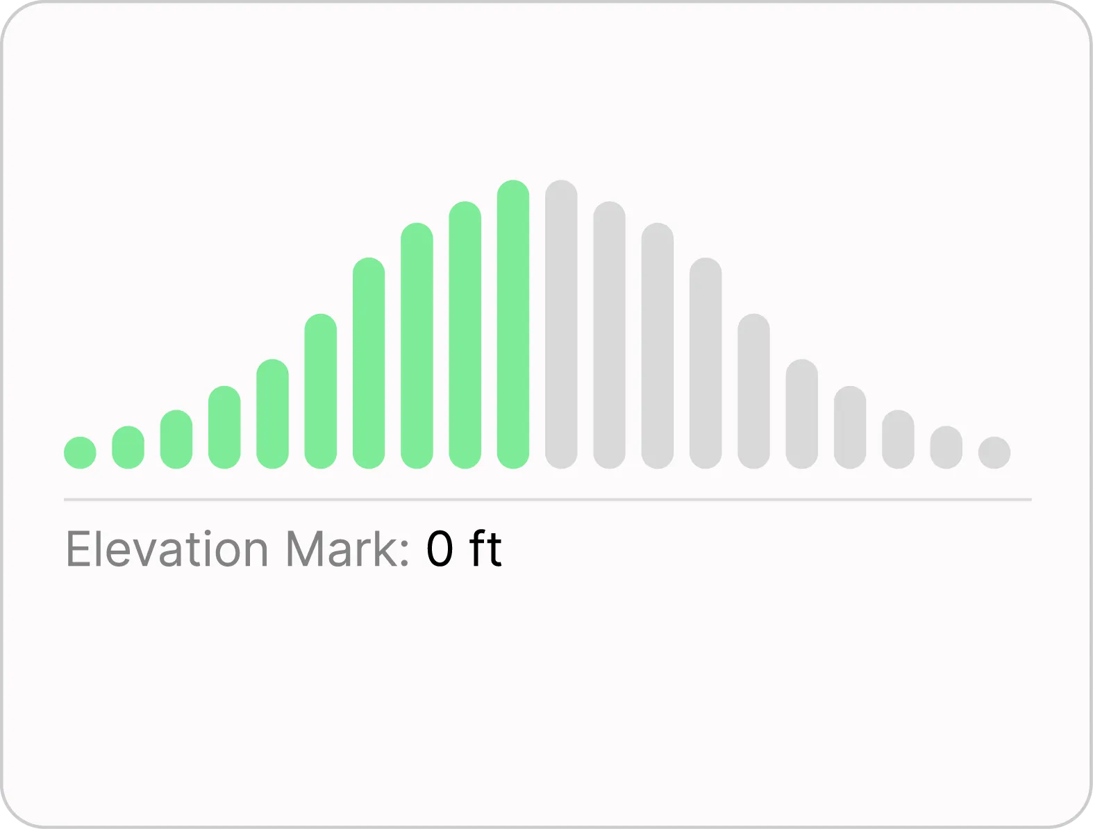
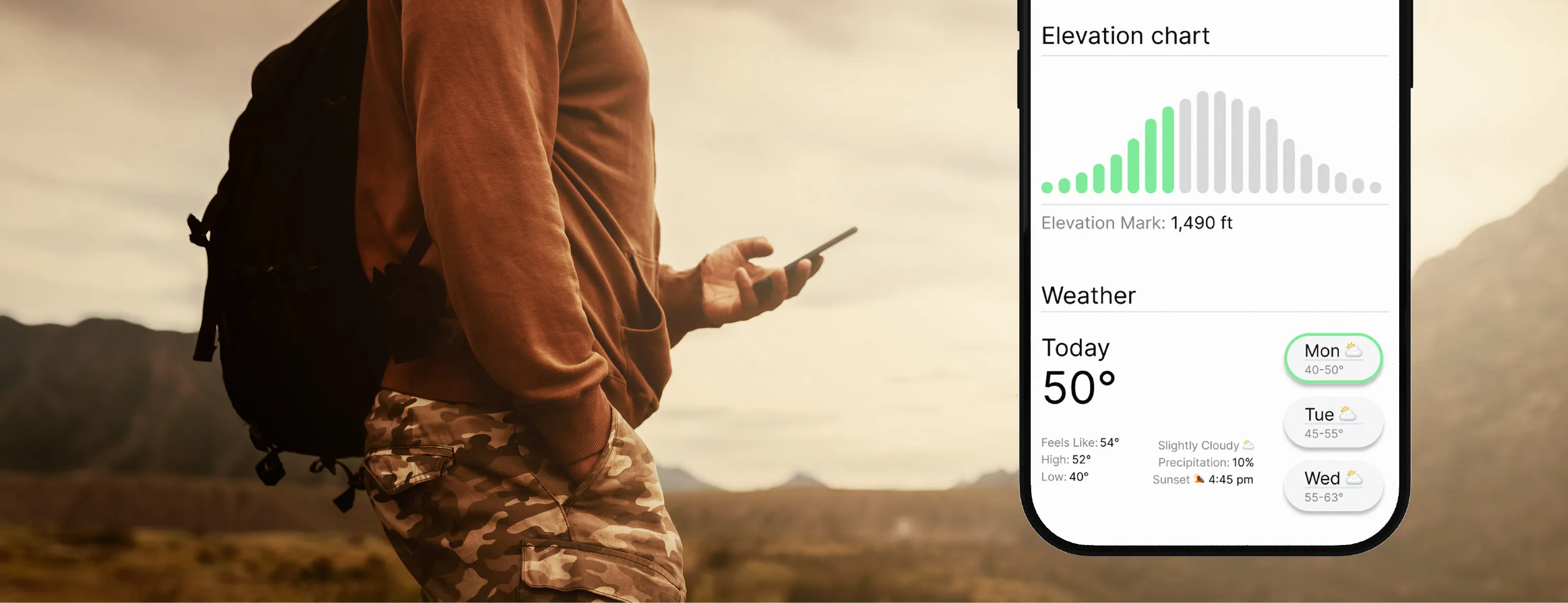
Elevation Chart
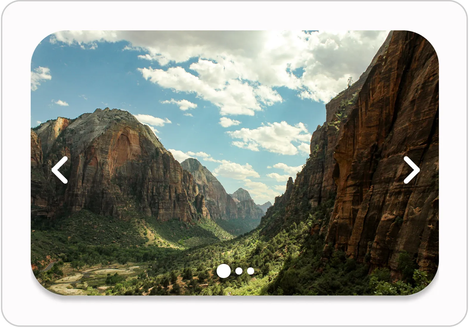
Carousel
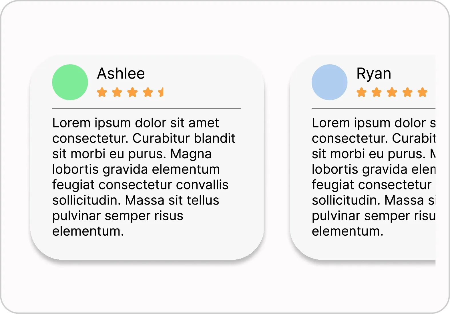
Review Carousel
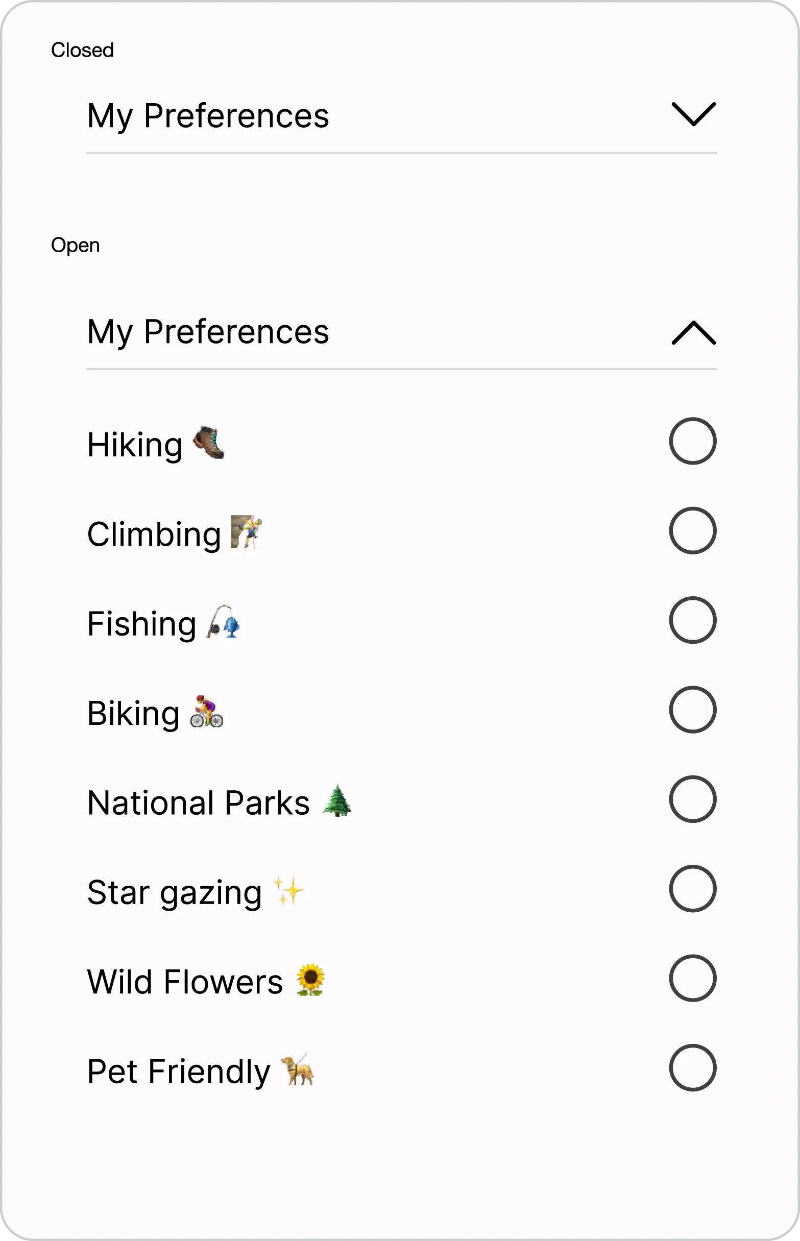
Accordion
Text Input Bar
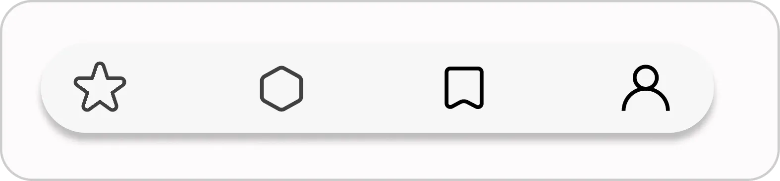
Lower Nav
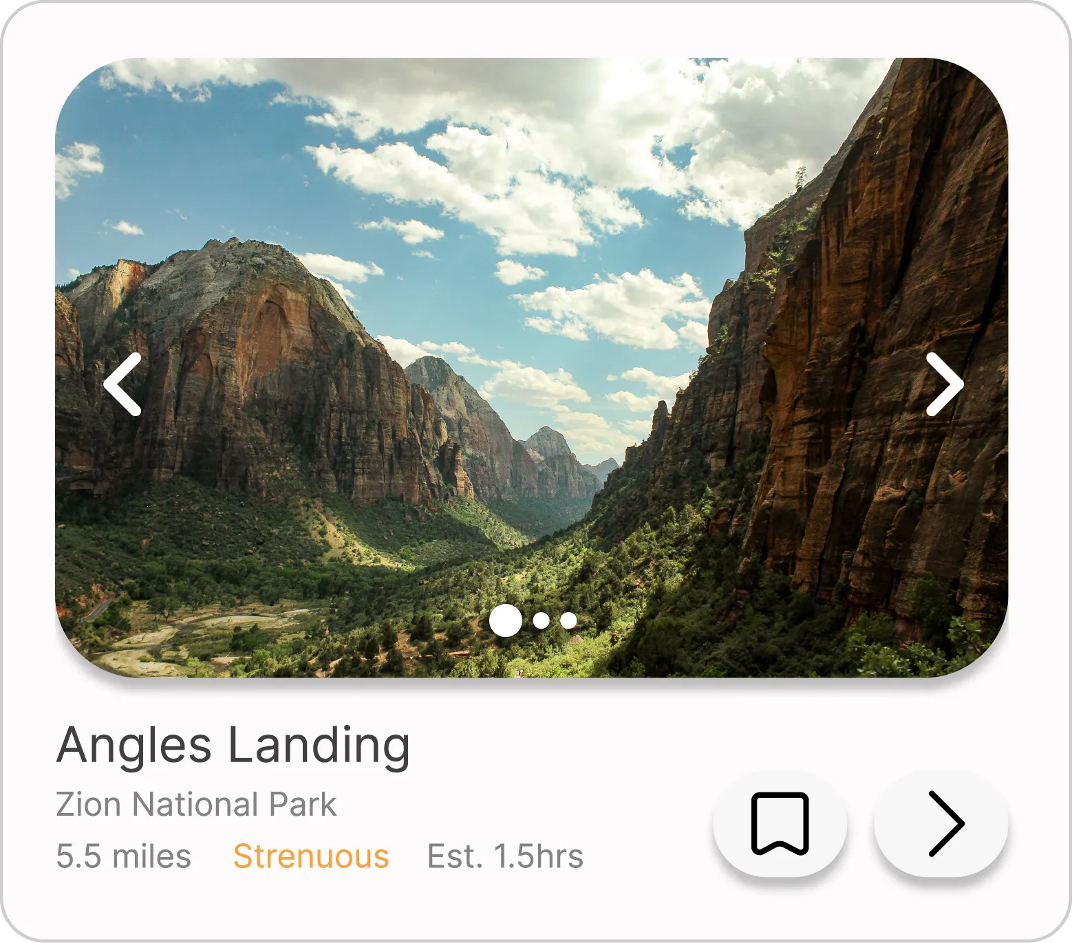
Card
Filter Bar

Organisms
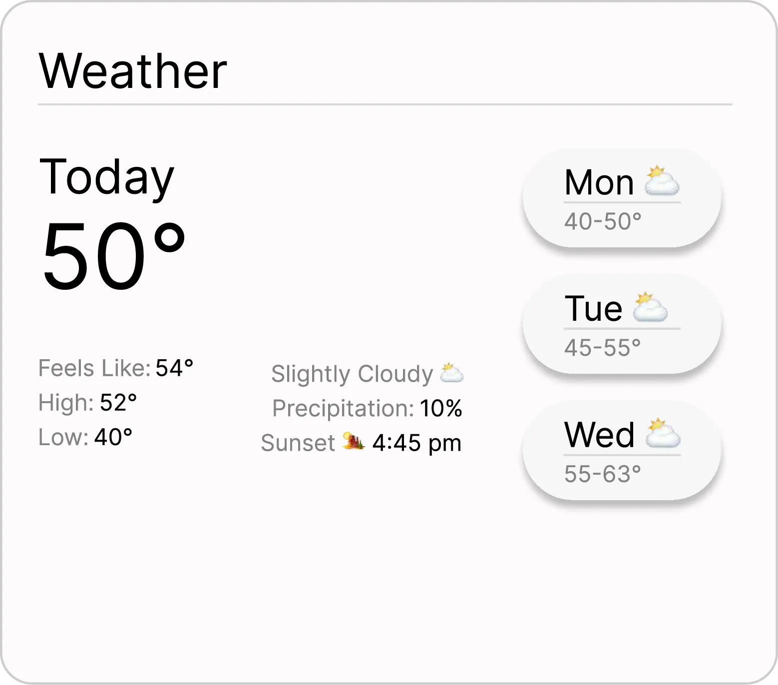
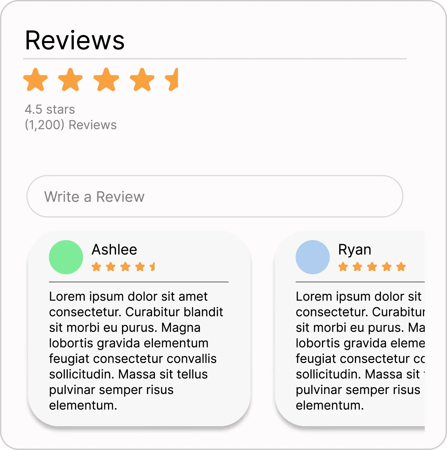
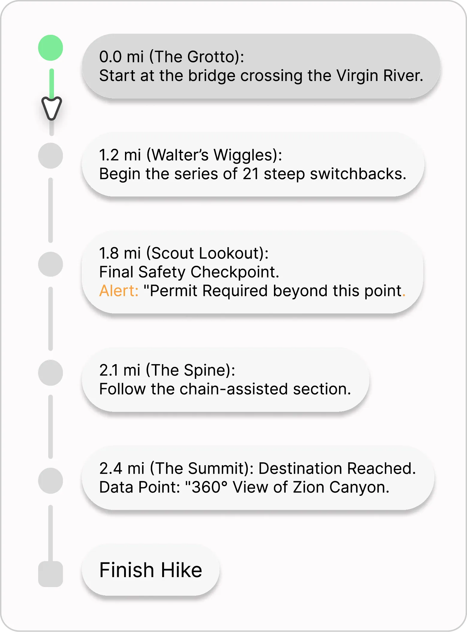
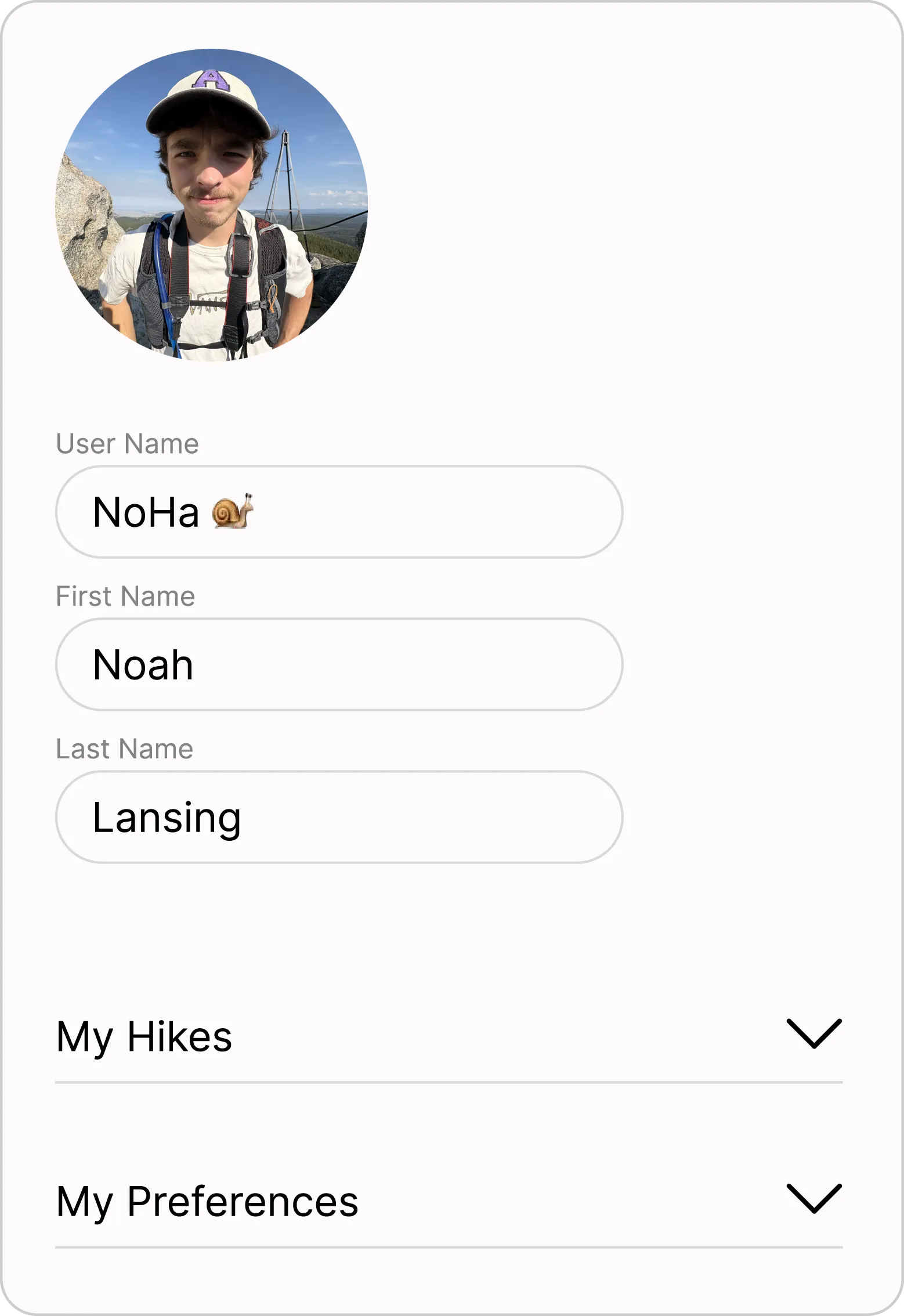
Organisms are where the components finally meet the user’s needs. They combine atoms and molecules into distinct sections of the interface. The goal is to create context, demonstrating how each part of the system functions as a cohesive unit to help the user navigate the app and complete their goals.
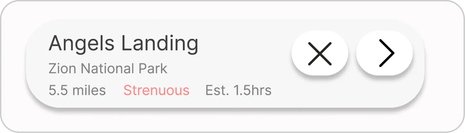
Location Card
Weather Frame
Review Frame
Progress Map
Profile Section
Upper Nav
Implementation
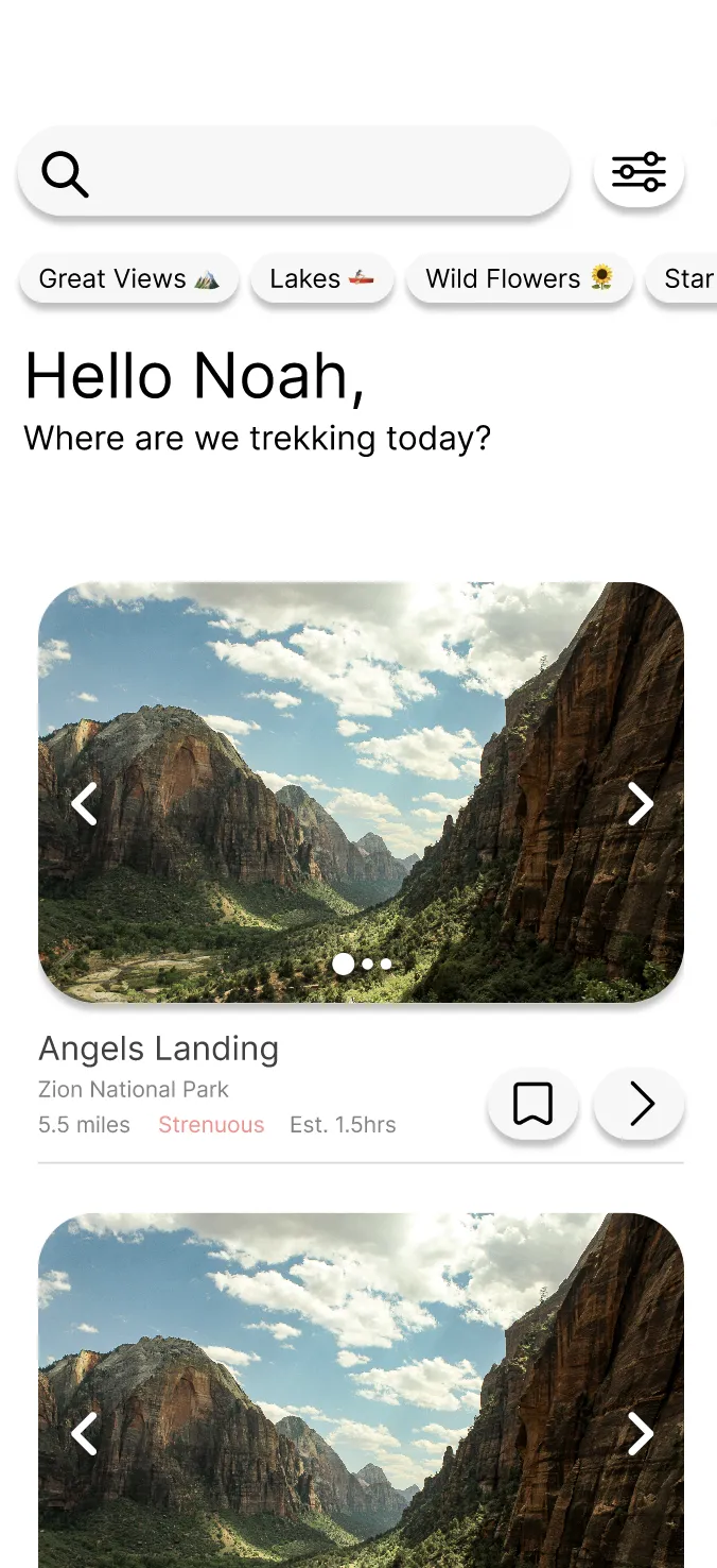
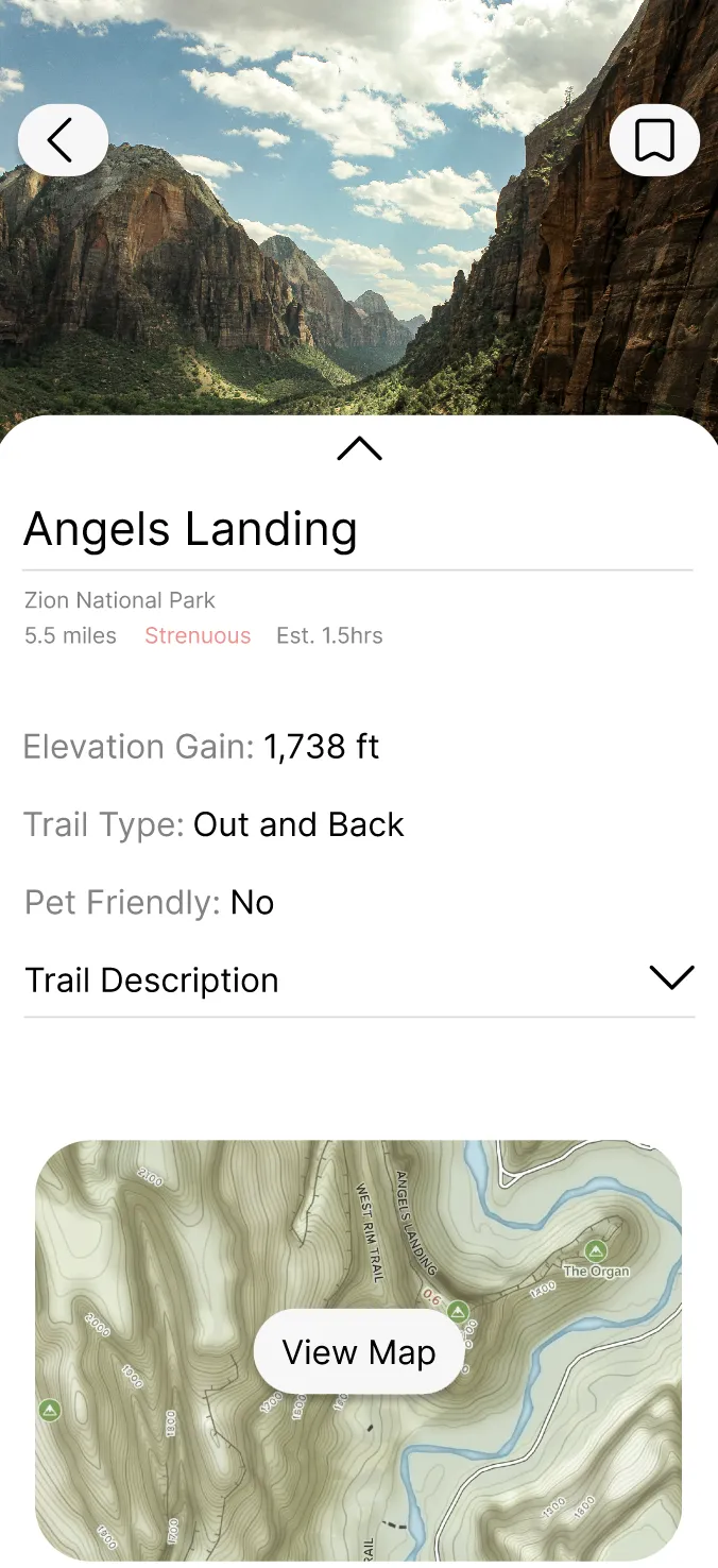
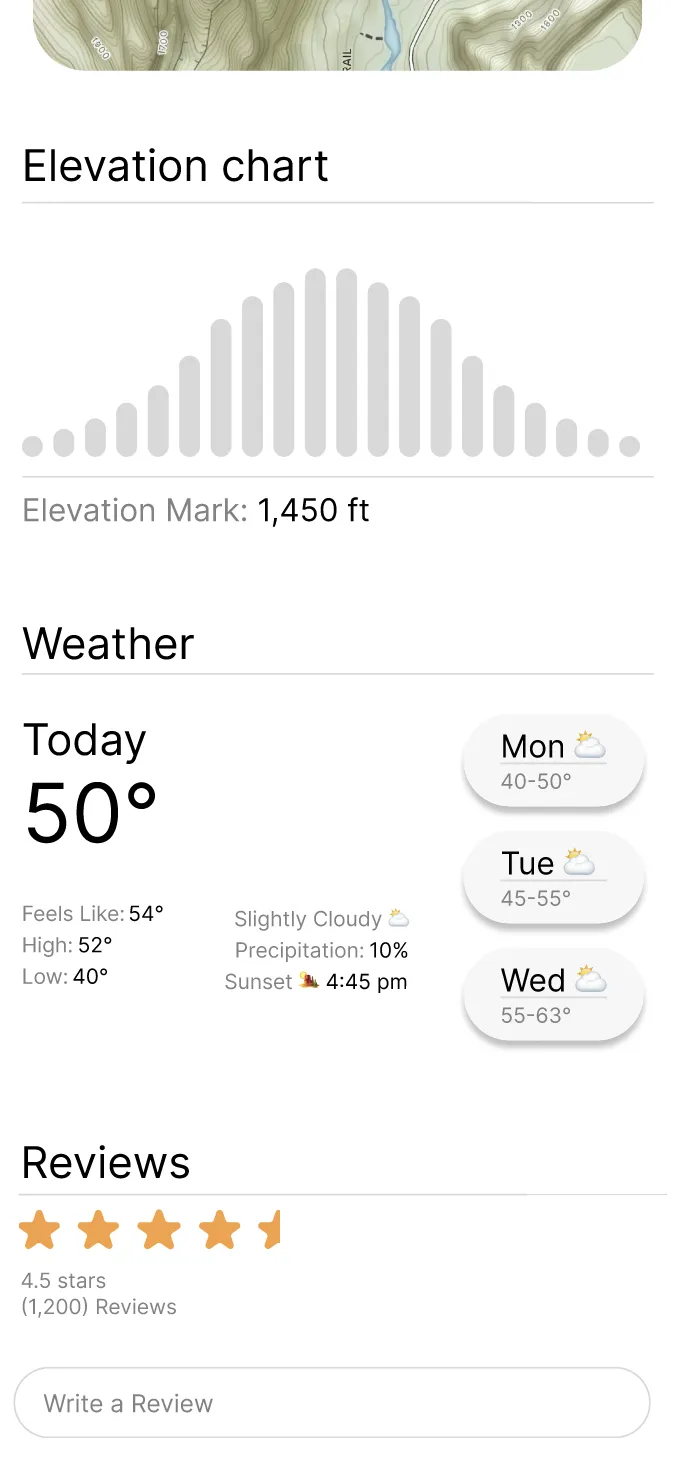
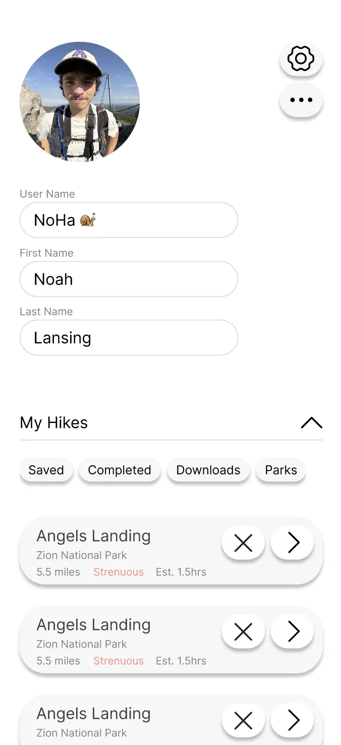
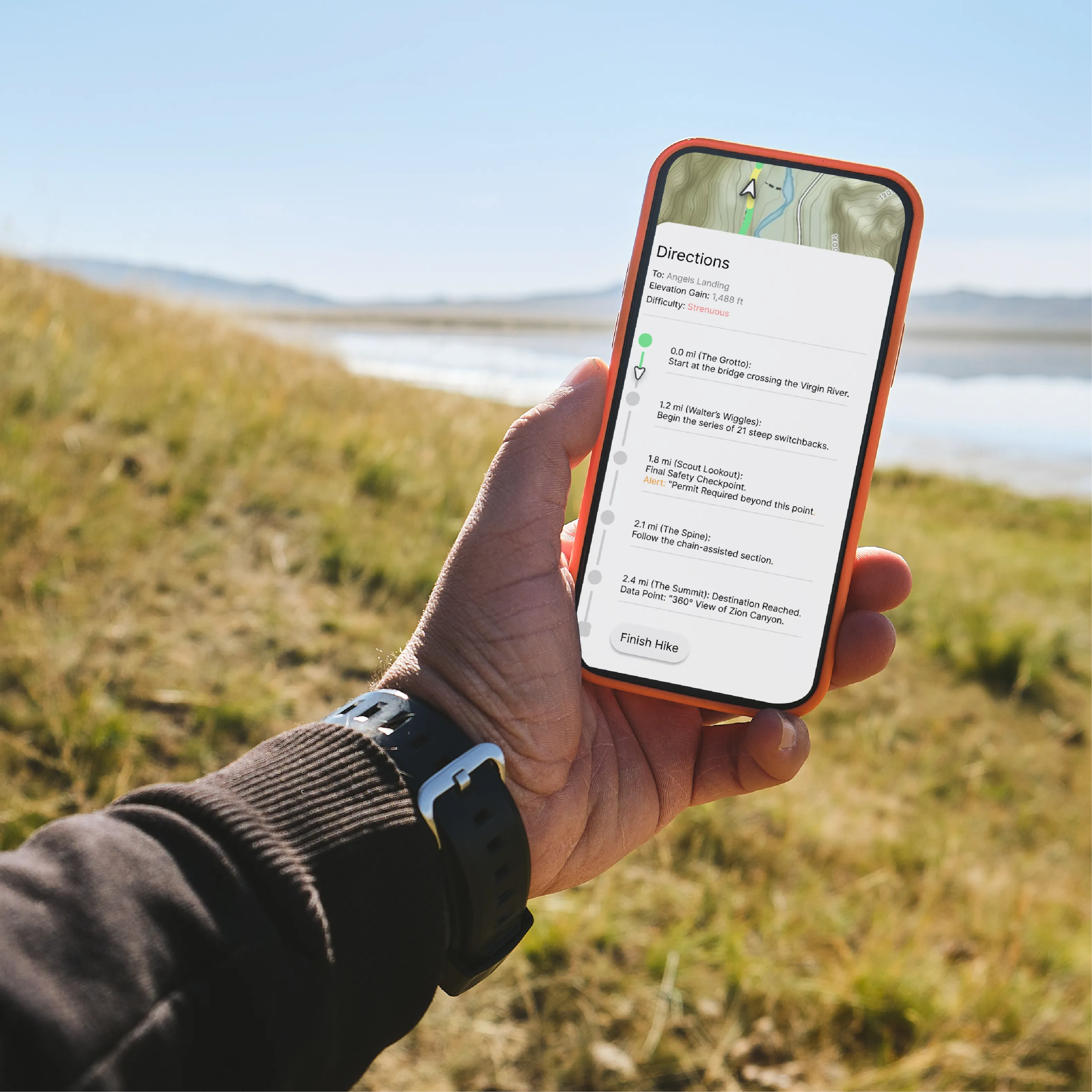
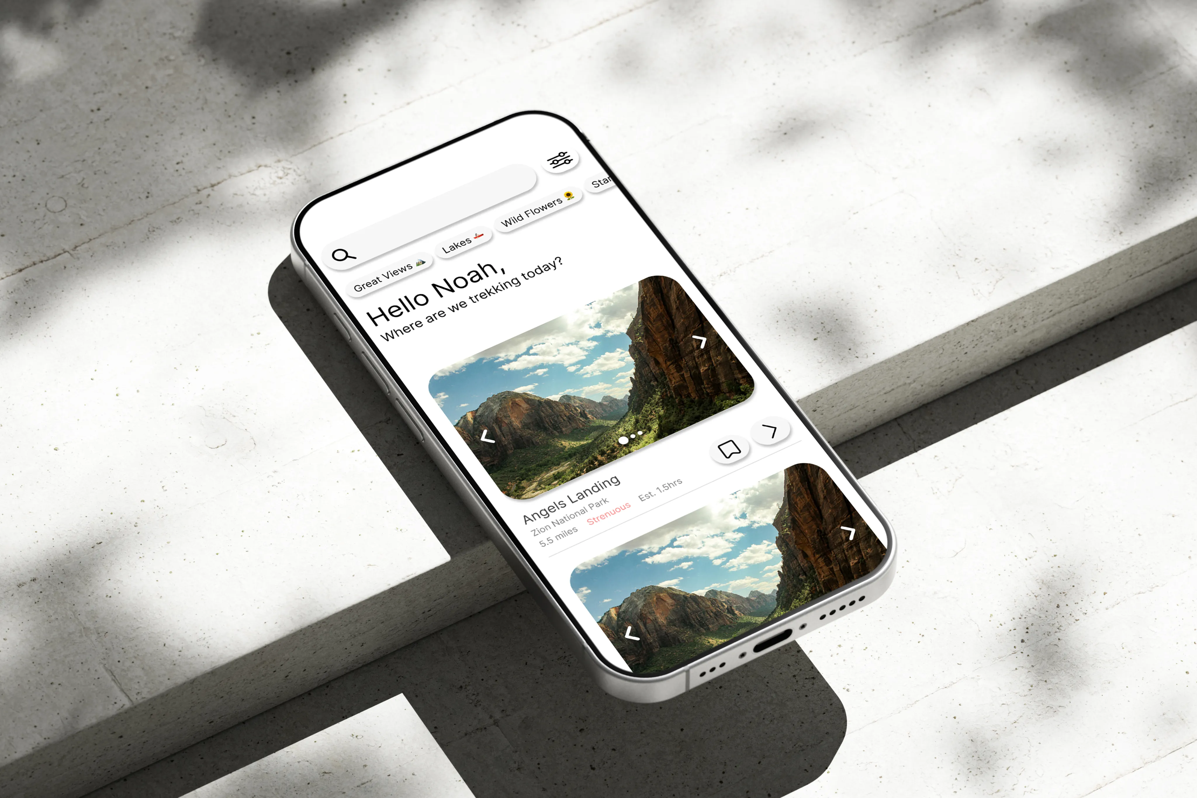
The final step was bringing the atoms, molecules, and organisms together into full application screens. This stage is where the system moves from theory to practice, showing how the components create a feasible, high-functioning product with clear interaction and context.
Conclusion
Building the TREK UI Kit was a great exercise in consciously designing UI systems. It forced me to look beyond individual pages and engineer components from the ground up, scaling intentionally from atoms to molecules, organisms, and full implementations.
Reflecting on the process, my natural next step would be exploring the kit's responsiveness and evaluating how these mobile-focused components translate to desktop interfaces. Additionally, I would love to tackle the challenge of developing a broader, multi-brand design system, shifting the focus from a hyper-specific aesthetic toward an expansive, utility-driven component library engineered for complex functionality.